

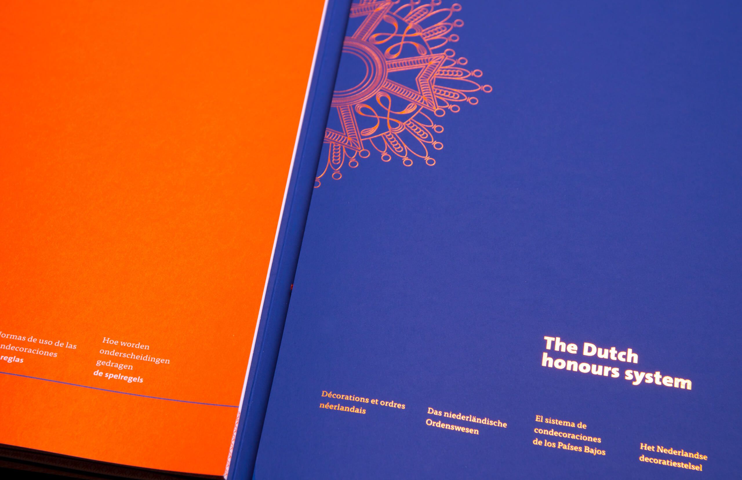
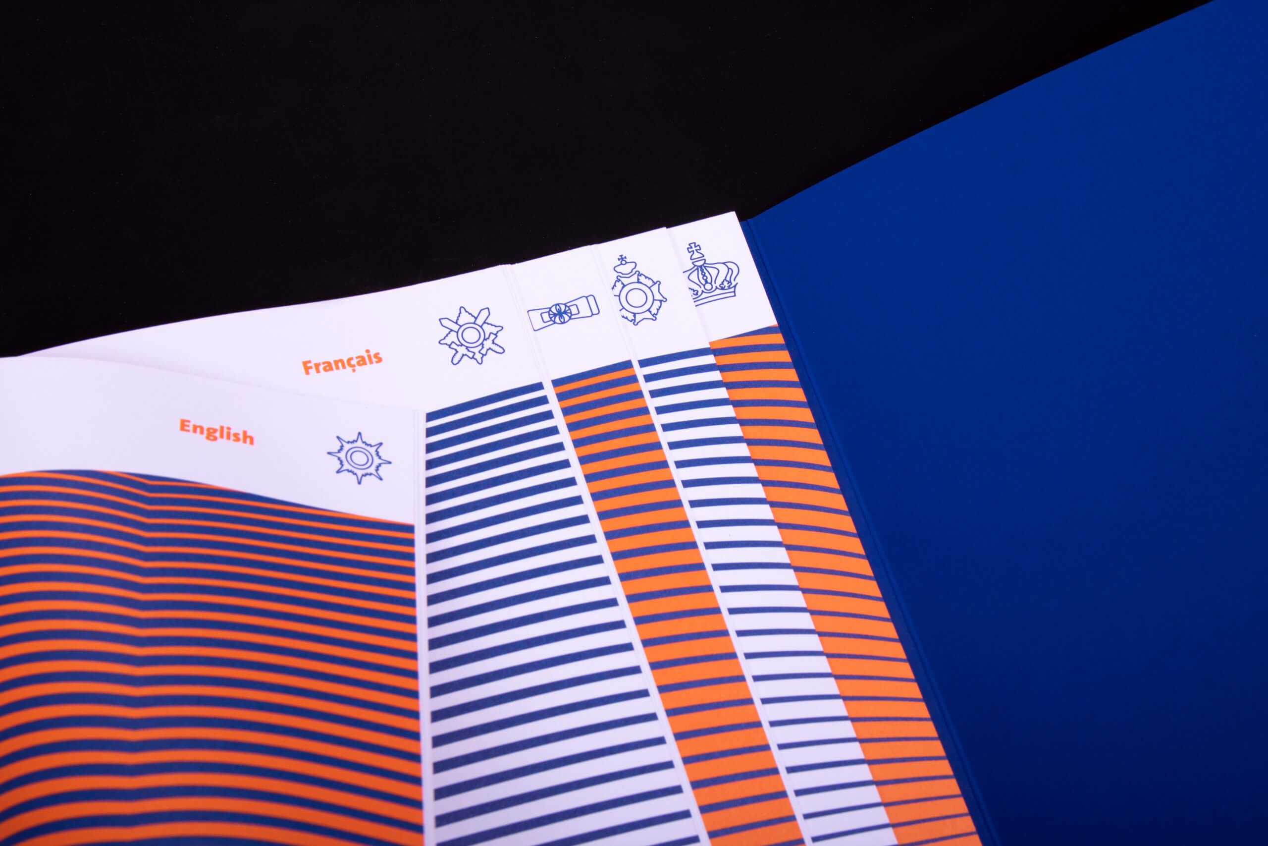
By physically separating the guide book into different parts and languages. And by dividing the practical information from theory.
This form was established in close collaboration with the Chancellery and Chancellor of the Royal Dutch Orders. The feeling 'of something special' was the key point.
'Blue blood', but also the connecting color with the Royal prominence and the case (cover) in which they where delivered.
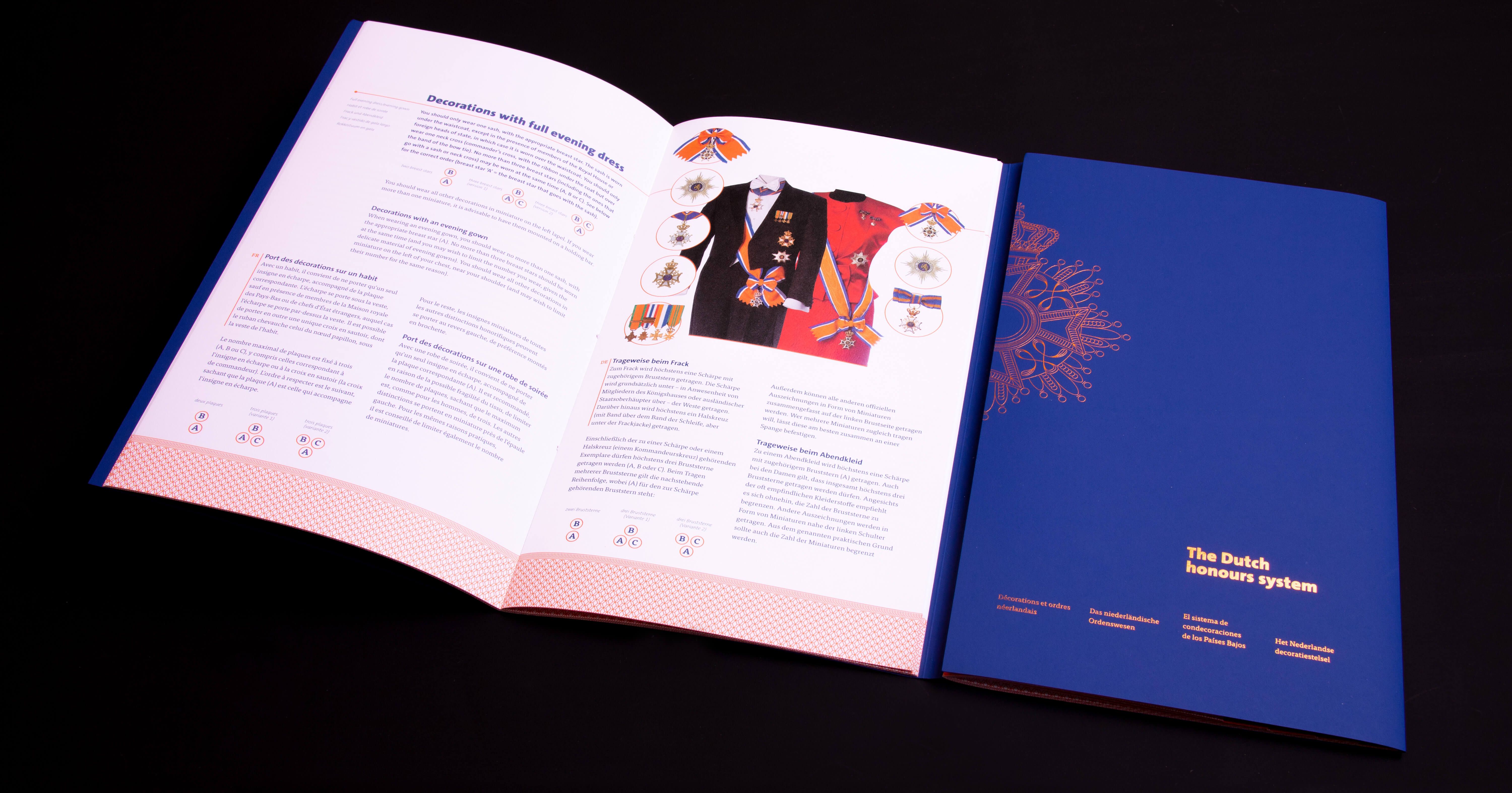
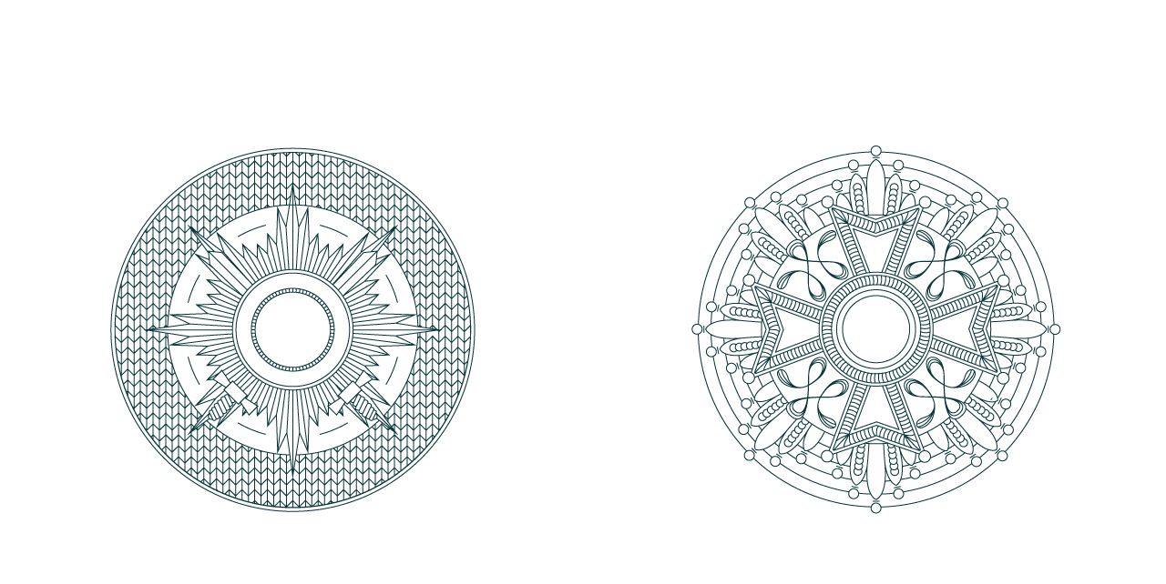
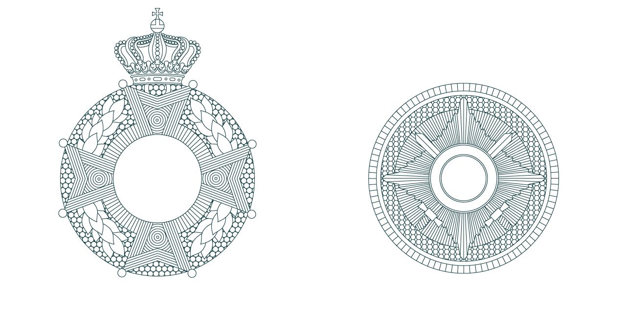
The Chancellery of the Royal Dutch Orders (De Kanselarij der Nederlandse Orden) assesses and distributes royal honors. The most well known royal decoration in The Netherlands is known as ‘the ribbon’. It’s something you are awarded in recognition of doing good and if you do get one, you’re going to need to know how to wear it. We developed stylish guide book, let’s call it a How-To for exclusive owners of royal honours. This exclusive hardback with orange stitching down the spine and copper foil illustrations almost deserves its own medal.
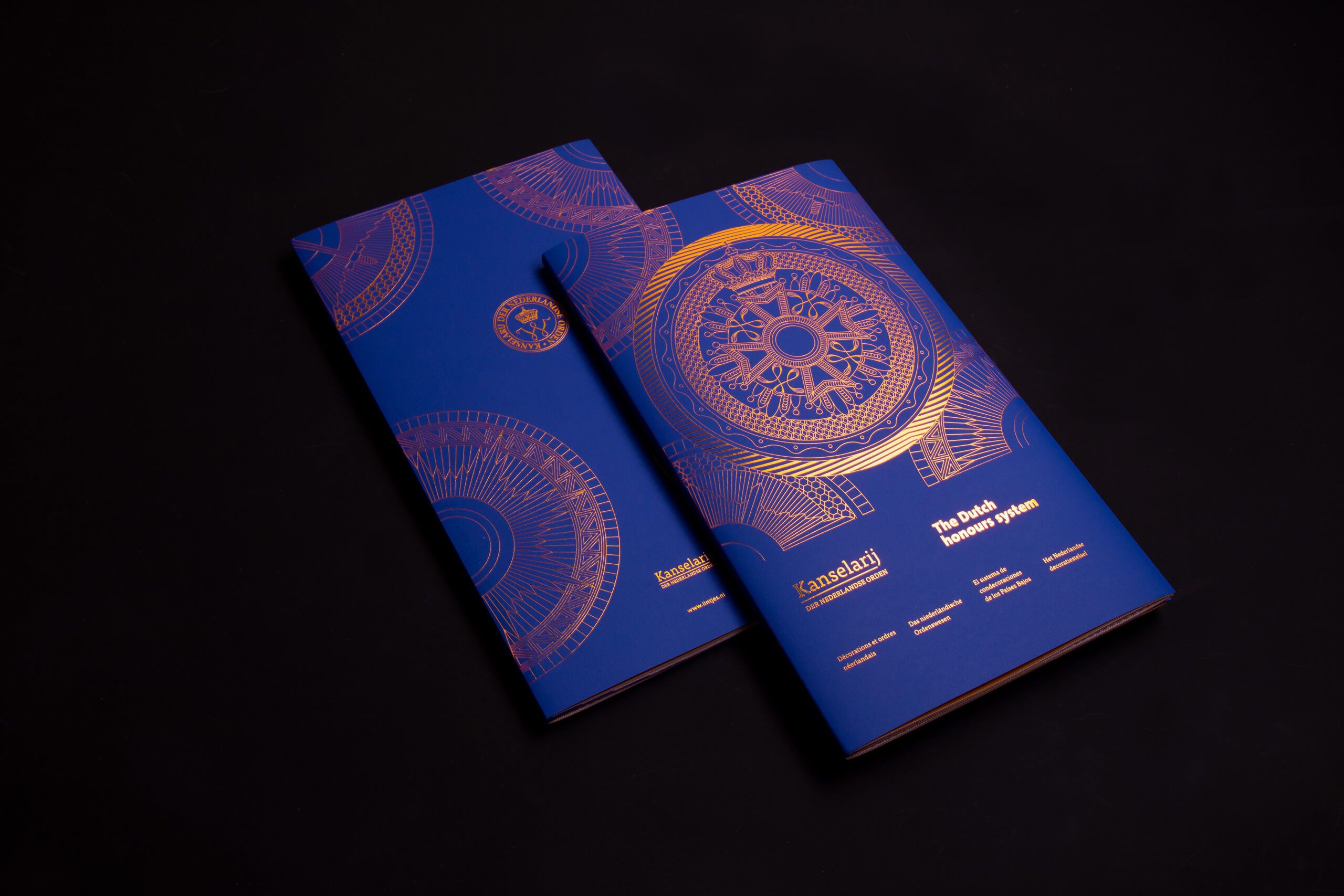
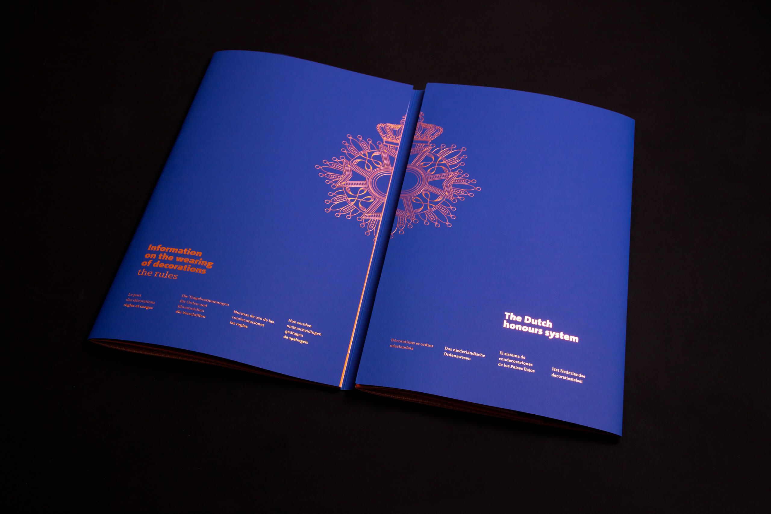
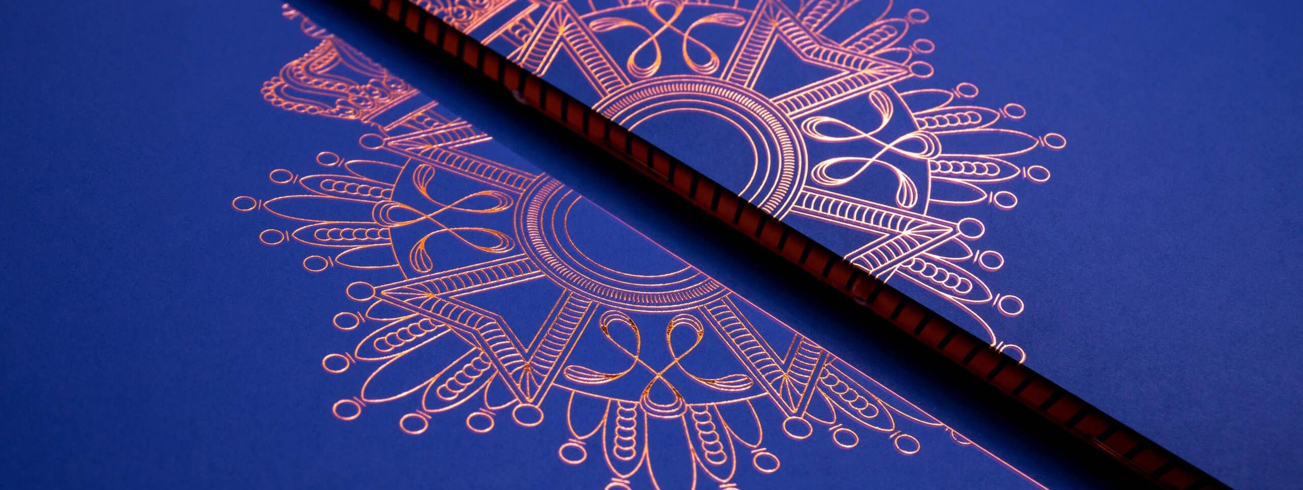
We have recently worked with great pleasure on a special brochure for the Chancellery of the Dutch Orders. We designed the guide book for the Royal prominence.
In close collaboration with the Chancellery of the Dutch Orders, we made an exclusive brochure that explains how to wear Royal decorations in 5 languages.
The brochure consists of two booklets that are bound in one cover with cahier stitch and orange yarn. The royal blue cover is provided with text and illustrations in copper foil. The rules are in the left-hand book. In the right-hand book you will find information about the Ridder orders.


Back to project overview
Want to know more?
 Back to the top